 Have you ever walked into a room and immediately felt at ease?Have you ever stepped amidst greenery and lost all your worries?
Have you ever stepped amidst greenery and lost all your worries?
Have you ever gone to a restaurant and lost your appetite?
Have you ever had strong feelings about something only to have trouble explaining why when asked about it?
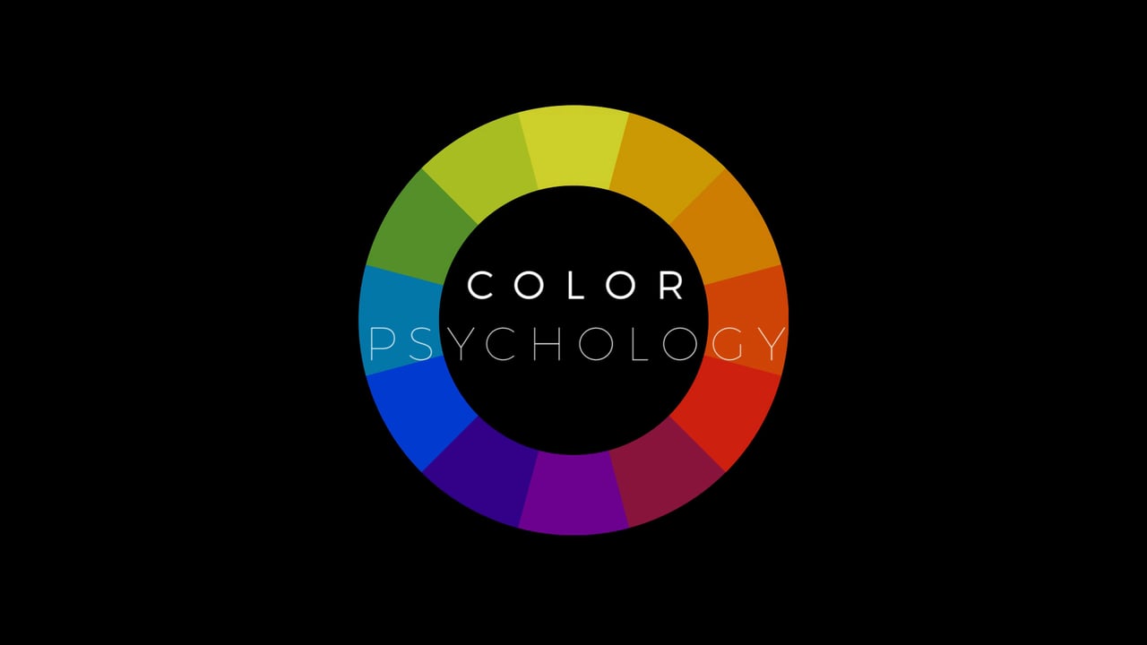
Behind all of the above lies a simple principle – colour psychology.
Colour psychology, in simplest of words, is the study of how colour affects people’s emotions, opinions, and behaviours. If you own a business or work on the marketing side of things, you can obviously see the relevance of this discipline.
Colour psychology has tremendous applications in marketing. If used right it can persuade a prospective customer to turn into an existing customer passively. In fact, colour psychology is like a passive customer acquisition and retention technique.
You’re most probably thinking that mere colour can’t have that big an impact on a business’s marketing successes. Maybe you’re discounting colours as supporting cast rather than the star performer. While colours may not play the lead role in the stories you’re trying to convey to your audience but they can be the difference between your strategy working or bombing. Here are some independent proofs that colour psychology really is effective.
Proving the Veracity of Colour Psychology
 We’re going to prove the veracity of colour psychology to you by way of the three most well-known experiments conducted by three different actors – Pinterest, CoSchedule, and HubSpot. Now, it is worth noting that each of these three is a recognisable name from the online arena.
This was a study conducted on Pinterest – the image sharing social media platform. It was a simple enough study where the powers that be analysed the sharing rate of various images in terms of their dominant colours. The study had some very interesting findings. The most notable of these was that people are more likely to share images that have warm colours than cool colours.
Warm colours such as red and pink incite active emotions. This is why they tend to incite action. Cold colours such as blue and green, however, calm and soothe which is counterproductive when it comes to persuading someone to do something.
CoSchedule
CoSchedule’s effort was more of an experiment than a study. In this experiment, what CoSchedule did was try out different background colours for their posts on Facebook. Their findings affirmed what was found in the previous study.
They found that people were most likely to share posts with an orange background and least likely to share posts with a blue background. Another element worth noting in this experiment is that the orange backgrounds probably drew the eye more considering that Facebook’s colour is blue.
HubSpot
HubSpot’s experiment was more akin to an A/B test more than anything else. It was a genius test though. They created two identical pages with the single difference being different coloured Call-To-Action (CTA) buttons. In one they used green, which matched the overall colour scheme and design.
In the other, they used red, which contrasted to the overall colour scheme and design. The page with red button performed 21 percent better than the page with the green button. This finding backs the premise that contrasting colours used wisely yield better conversion rates.
Understanding Colour Psychology
 Subliminally, colours do a lot that we don’t realise. Here’s a list of subtle influences of colours.
- Many times, our eyes move according to the colours we’re looking at. For example, if you put a button with a contrasting colour on a web page, you’re likely to see a change in your conversion metrics. The reason for this is that the opposing colour of the button will draw the eye of the visitors. This is due to what is called the von Restorff effect or the Isolation Effect.
- Colour can also be used to tell someone what to do. There’s no better example of this than traffic lights.
- Context is another thing that colours provide. For example, when you see a green coloured product, you will automatically think that it is herbal, organic, or vegetarian.
There’s a lot more that colours can do than just these three things. While on a general level, these three influences of colours are important, different colours have different impacts. Consider restaurants. Have you ever noticed that high-end buffets tend to have blue cutlery, while high end a la carte restaurants have red interiors? This is because the colour blue suppresses appetite and the colour red incites it.
That was a highly specific example of how colours can be used when it comes to dealing with people in business. Generally speaking, as per Neil Patel of Quicksprout, colours have as much as 85 percent say in a buying decision. However, it isn’t just about choosing the right colours because the marketing environment is very dynamic these days. If you want to use colours to improve your lead generation and conversion rates, then you’ll have to follow a strategy to implement them.
Colour Psychology in Business
 In the majority of cases, you’ll be using colour psychology to influence potential customers into becoming returning customers. However, you can use colours in other ways as well. The methodology is the same too.
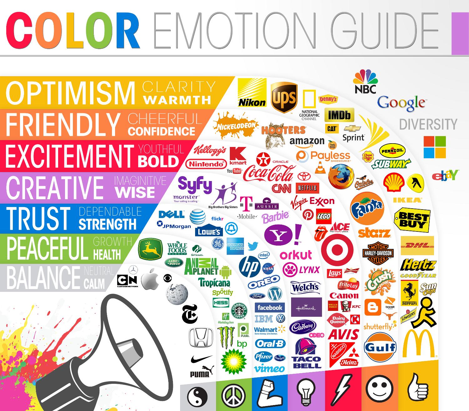
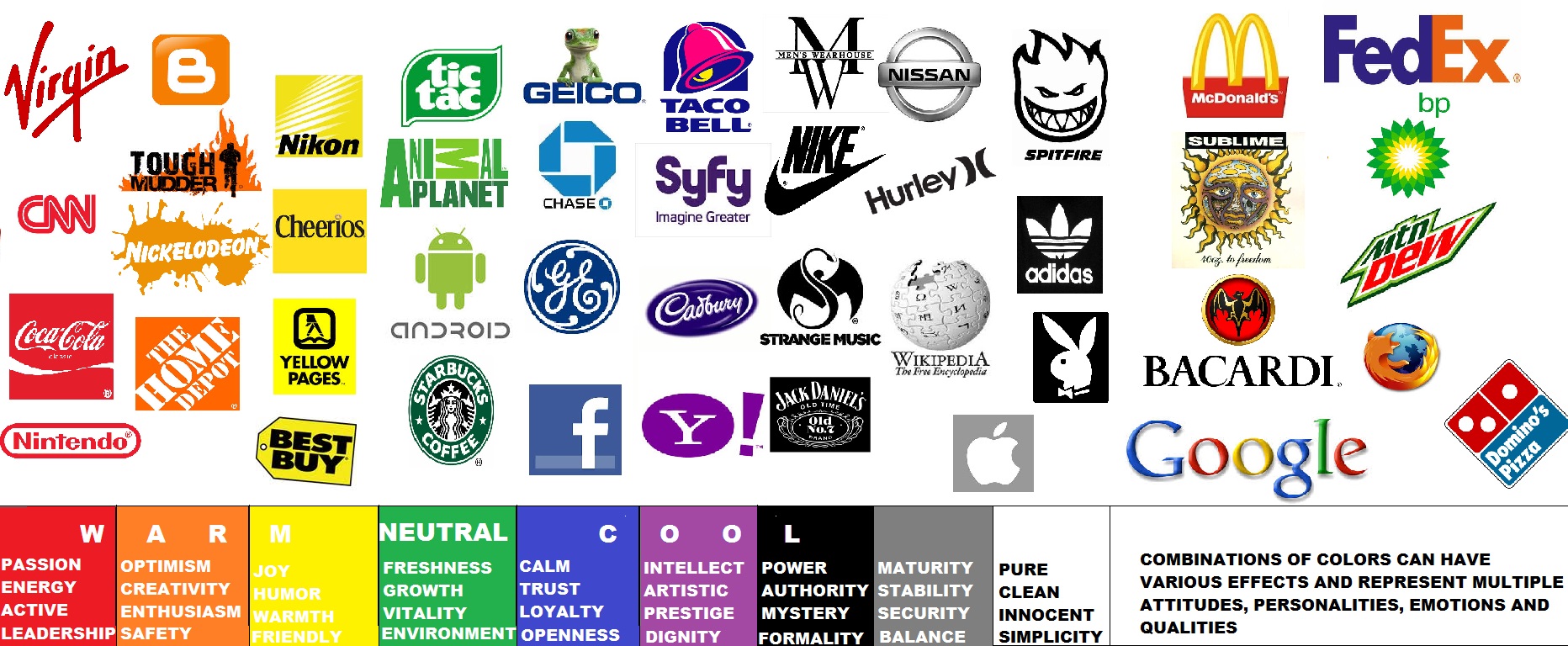
Different industries and businesses approach their audiences differently. For instance, most businesses’ go-to choice of value proposition is professionalism and reliability. Invariably, you’ll find businesses in this sector associated with the colour Blue because it denotes reliability and trust.
This is also the fool proof option for businesses that operate in the financial sector or offer B2B services. However, some businesses tend to favour portraying a wild, creative, and innovative persona. You’ll notice this kind of business personality the most in media and marketing sectors. Such businesses will typically use a riot of colours.
However, even within industries, there can be variation. Compare Woodland with Nike for example. Both sell shoes but they sell to different audiences. While Nike caters to the sporty audience, Woodland caters to the adventurous audience. If you compare the logos of these brands, you’ll see the adventurous Woodland sporting brown denoting ruggedness while the sporty Nike using the simple black denoting power and strength.
The Colour Psychology Methodology
 As you can see, there’s a lot to consider in colour psychology which is why a methodology is recommended. The methodology we speak of revolves heavily around two things. The first is to understand your audience vis-à-vis your industry. As explained above, the industry your business operates in and specific personality traits of your customers will have a major bearing on how you use colour psychology.
To that end, the first thing you’ll need to figure out is the personality traits of your audience. For this, we recommend focusing on demographic and psychographic metrics. Demographic metrics are physical metrics such age, gender, location, profession, annual income etc. Psychographic metrics are more diverse and basically, relate to interests and hobbies of your target audience.
Simultaneously, you’ll need to see what your competitors are doing to check what works in your industry. Once you understand your audience and your industry, you’ll need to make a call on how to structure your strategy. Between your target audience details and industry norms, you’ll get a shortlisted range of colours that suit your business most. You can choose to follow what is prevalent in the industry or decide to buck the trends and stand out from your competitors.
While the colour of your logo should remain consistent, colours you use on your marketing material can vary according to the objective and theme of your campaign. Even so, you’ll have to take into account costs and technical restrictions when choosing colours. For instance, shades you can get online may not be available on offline marketing collateral.
Leave a Reply